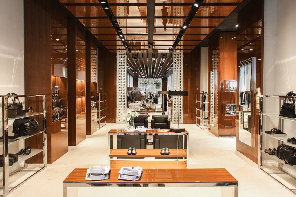
If you’re a retail store owner or manager, you’re always on the lookout for ways to drive product sales. And in this area, good visual merchandising is crucial – not only do people process loads of visual information, it can have a strong and immediate impact on their reactions, and therefore their impulse decisions.
Brick-and-mortar stores in the digital world still offer the unique experience of physical interaction with a product. You’ll be doing your brand a disservice – including efforts and expenses in marketing and packaging design – if you don’t take advantage of the unique opportunities that your retail storefront presents.
Here are a few things to consider that can help drive up your retail numbers.
Continuity
Your brand campaign doesn’t end with the product that’s delivered to your warehouse. You must showcase the product in your store in a manner that reflects the same targets. For example, the use of space is a subtle and robust signal of price point. Jam-packed displays of many different products communicate affordable or discount goods and can be effective at drawing customers towards low priced items. However, employing the same sort of display when selling elegantly packaged luxury items creates dissonance and confuses customers.
Taking the lead from the marketing plan and being in step with overall design and packaging is a sign of continuous vision and excellent communication across the board.
Get creative
As head of store operations, you’ve seen to it that your location is well lit and furnished, and all the products on display are organised in shelving units that have a logical order. You may delegate creative tasks to others, or bring in outside contractors to help out. But it’s still up to you to provide the drive and vision behind creating a great point of purchase (POP) display that brings into focus the best attributes of your product, and how your customer experiences everything.
Many food retailers offer taste testing stations, for example. Clothing and accessory displays use mannequins to showcase the product in action. It’s essential to be deliberate about which products gain focus and where in the store this is located. If you pay attention to how customers navigate your store and where they tend to spend the most time, you can place electronic tablets nearby to encourage further interaction, displaying products that are found deeper in the store.
Most retailers don’t have unlimited space to work with, and you probably also sell other products. Great POP displays guide the customer’s attention around the store, eliminating distractions, getting them to explore and experience your product.
Change it up

What’s become familiar is easy to tune out, and what is new grabs the attention. Designers and marketers know it, and so do you – but who wants to go through the same effort of planning and changing an entire store display every couple of weeks?
Keeping things fresh doesn’t have to entail periodic makeovers. You can create interest with a special promo or giveaway that changes every day; add small elements to window displays to reflect changes in season or special holidays.
Change the placement of different products based on what seems to sell best and what grabs most customers’ attention. It’s something you’ll get the hang of as you pay close attention to your store and your customers.
Approach visual merchandising as a process of coming up with an initial on-point, creative, interactive display for your product – then taking time to observe it at work, and making periodic changes to keep things fresh – and watch as your numbers grow.

